Section Schema API Reference: Building Custom Components
A section is the backbone of how a page shows its content. It holds structured data and decides which fields you content editors can interact with in the Customizer. The magic happens thanks to the section schema, attached to the React component in your storefront code.
The section schema
The section schema integrates with the prototype of your React component. This schema dictates the structure of the final data object and its accessor keys. Now, let's dive into crafting a simple schema and section to see this in action.
- Name
label- Type
- string
- Description
A human readable label for your section.
- Name
key- Type
- string
- Description
A unique identifier for your section.
- Name
category- Type
- string
- Description
An optional string that lets you categorize this section. For example, "Heroes" or "Text Blocks".
- Name
fields- Type
- Array<Field>
- Description
An array of supported fields that make up your section.
- Name
datasource- Type
- DataSource
- Description
At the moment we only support Shopify Metaobjects, with more supported sources coming in the future.
An optional configuration to allow your section to pull from 3rd party data sources.
Schema Definition
type Schema = SchemaObject | SchemaFunction

interface SchemaObject {
  label: string
  key: string
  category?: string
  fields?: Array<Field>
  datasource?: DataSource
}

interface SchemaFunction {
  (): SchemaObject
}

interface DataSource {
  source: 'shopify'
  type: 'metaobject'
  reference: {
    type: string
  }
}
Example Component
export const HelloWorldBanner = ({ cms }) => {
  return (
    <div>
      <h1> Hello World, my name is {cms?.yourName} </h1>
    </div>
  )
}

HelloWorldBanner.Schema = {
  label: 'My Hello World Banner',
  key: 'helloWorldBanner',
  fields: [
    {
      component: 'text',
      name: 'yourName',
      label: 'What is your name?',
      description: 'The name which the banner will greet you.',
    },
  ],
}
Text Field
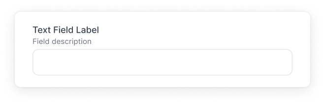
A Text field is a single text input. You can use this field for short strings such as titles, handles, or headings.
- Name
component- Type
- string
- Description
The name of the component for this field. In this case
text.
- Name
name- Type
- string
- Description
The name of the accessor key for the final content.
- Name
label- Type
- string
- Description
A human readable description of what the field is.
- Name
description- Type
- string
- Description
An optional string to allow you to add more context about the field.
- Name
defaultValue- Type
- string
- Description
An optional string to set the default text value.
- Name
validate- Type
- object
- Description
An optional object that can include:
required: abooleanindicating if the field is required.regex: astringwith a regular expression for validation.errorMessage: astringto display when regex validation fails.
Interface
  interface TextField {
    component: 'text'
    name: string
    label: string
    description?: string
    defaultValue?: string
    validate?: {
      required?: boolean,
      regex?: string,
      errorMessage?: string
    } | ((...args: unknown[]) => unknown)
    required?: boolean
  }
Example
  {
    component: 'text',
    name: 'heading',
    label: 'Hero Heading',
    description: 'Main text for Hero',
    defaultValue: 'Hello world',
    validate: {
      regex: "^(?=.{5,10}$)(?!.*\\d).$",
      errorMessage: "Heading must be 5-10 characters long and contain no numbers"
    }
  }
Return
  {
    heading: 'Hello world'
  }
Text Area Field
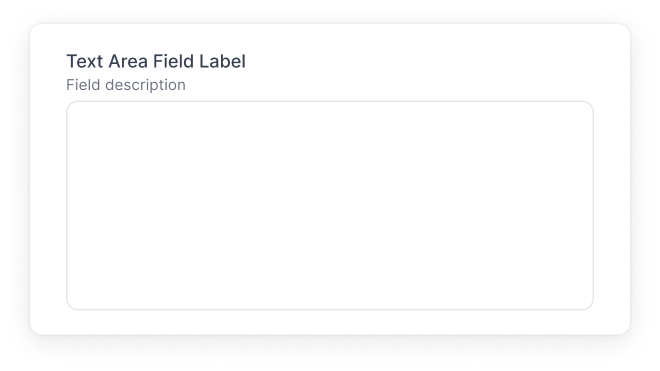
A Text Area field is multi-line text input. You can use this field for longer strings such as copy, descriptions, or details.
- Name
component- Type
- string
- Description
The name of the component for this field. In this case
textarea.
- Name
name- Type
- string
- Description
The name of the accessor key for the final content.
- Name
label- Type
- string
- Description
A human readable description of what the field is.
- Name
description- Type
- string
- Description
An optional string to allow you to add more context about the field.
- Name
defaultValue- Type
- string
- Description
An optional string to set the default text value.
- Name
validate- Type
- object
- Description
An optional object that has a
requiredkey with abooleanvalue to set if this field is required or not.
Interface
  interface TextAreaField {
    component: 'textarea'
    name: string
    label: string
    description?: string
    defaultValue?: string
    validate?: {
      required: boolean
    } | ((...args: unknown[]) => unknown)
    required?: boolean
  }
Example
  {
    component: 'textarea',
    name: 'faqAnswer',
    label: 'FAQ Answer',
    description: 'Short description for the question',
  }
Return
  {
    faqAnswer: 'Do this thing!'
  }
Image Field
Select an image from the media manager.
- Name
component- Type
- string
- Description
The name of the component for this field. In this case
image.
- Name
name- Type
- string
- Description
The name of the accessor key for the final content.
- Name
label- Type
- string
- Description
A human readable description of what the field is.
- Name
description- Type
- string
- Description
An optional string to allow you to add more context about the field.
- Name
defaultValue- Type
- string
- Description
An optional string to set the default image value.
- Name
validate- Type
- object
- Description
An optional object that has a
requiredkey with abooleanvalue to set if this field is required or not.
Interface
  interface ImageField {
    component: 'image'
    name: string
    label: string
    description?: string
    defaultValue?: string
    validate?: {
      required: boolean
    } | ((...args: unknown[]) => unknown)
    required?: boolean
  }
Example
  {
    component: 'image',
    name: 'heroImage',
    label: 'Hero Image',
    description: 'Image for hero banner',
  }
Return
  {
    id: "gid://shopify/MediaImage/27076979032264",
    src: "https://cdn.shopify.com/s/files/1/0629/5519/2520/files/men-posing-in-outerwear.jpg?v=1701459236",
    size: 550781,
    type: "file",
    width: 3000,
    format: "image/jpeg",
    height: 1989,
    altText: "",
    filename: "men-posing-in-outerwear.jpg?v=1701459236",
    directory: "",
    previewSrc: "https://cdn.shopify.com/s/files/1/0629/5519/2520/files/men-posing-in-outerwear.jpg?v=1701459236",
    aspectRatio: 1.508295625942685
  }
Rich Text Field
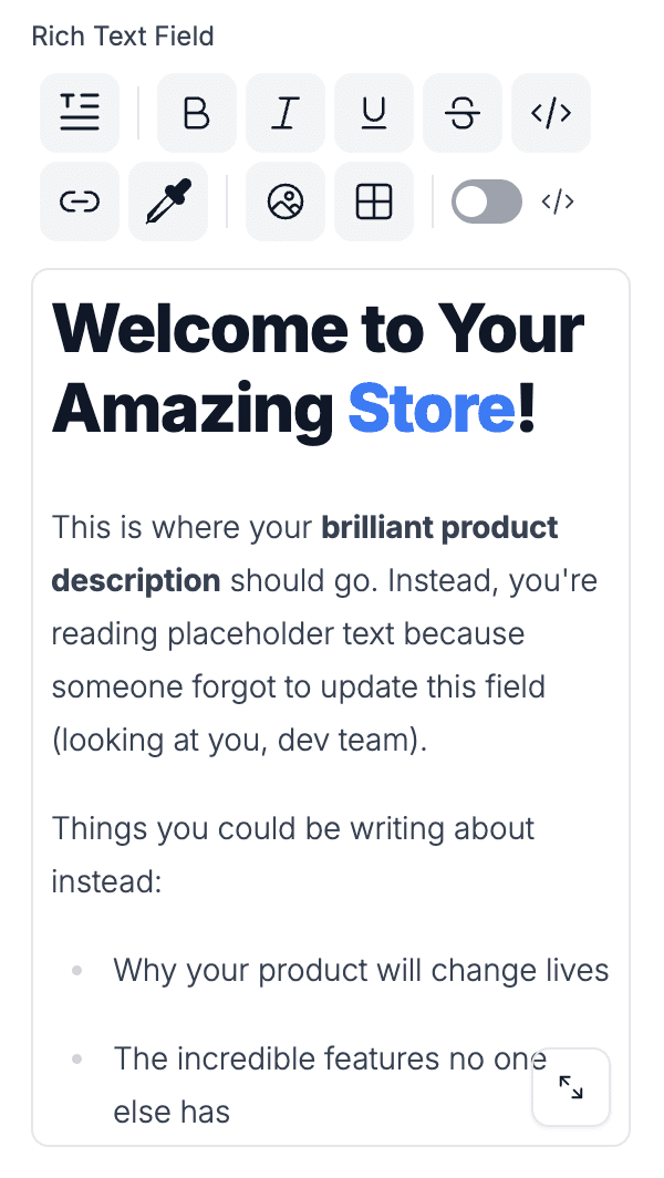
You can use this field to write rich text content. The output is an HTML string.
Your component will need to be set up to render an HTML string, and it is important that you should sanitize the HTML output. Our example from our Blueprint theme can be found here.
- Name
component- Type
- string
- Description
The name of the component for this field. In this case
richText.
- Name
name- Type
- string
- Description
The name of the accessor key for the final content.
- Name
label- Type
- string
- Description
A human readable description of what the field is.
- Name
description- Type
- string
- Description
An optional string to allow you to add more context about the field.
- Name
defaultValue- Type
- string
- Description
An optional string to set the default markdown value.
Interface
  interface RichTextField {
    component: 'rich-text'
    name: string
    label: string
    description?: string
    defaultValue?: string
  }
Example
  {
    component: 'rich-text',
    name: 'productInfoBlurb',
    label: 'Product Info Blurb',
    description: 'Short details and information about the product',
  }
Return
  <p>This is a product info blurb</p>
  <p>It can be multiple paragraphs</p>
  <p>And can include <strong>HTML</strong></p>
  <p>Like <a href="/pages/about-us">links</a></p>
  <p>Or images</p>
  <img src="https://via.placeholder.com/150" alt="Placeholder" />
  <p>Or lists</p>
  <ul>
    <li>Item 1</li>
    <li>Item 2</li>
    <li>Item 3</li>
  </ul>
Markdown Field
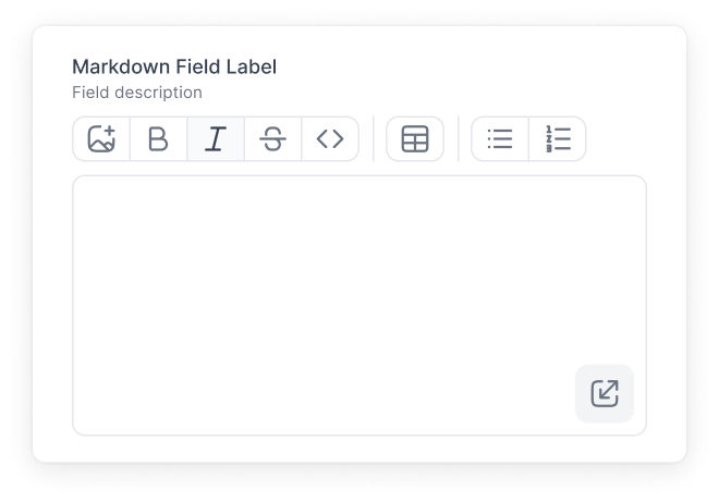
You can use this field to write markdown text.
Your component will need to be set up to render a markdown string. For example, a library like react-markdown can be used.
- Name
component- Type
- string
- Description
The name of the component for this field. In this case
markdown.
- Name
name- Type
- string
- Description
The name of the accessor key for the final content.
- Name
label- Type
- string
- Description
A human readable description of what the field is.
- Name
description- Type
- string
- Description
An optional string to allow you to add more context about the field.
- Name
defaultValue- Type
- string
- Description
An optional string to set the default markdown value.
- Name
validate- Type
- object
- Description
An optional object that has a
requiredkey with abooleanvalue to set if this field is required or not.
Interface
  interface MarkdownField {
    component: 'markdown'
    name: string
    label: string
    description?: string
    defaultValue?: string
    validate?: {
      required: boolean
    } | ((...args: unknown[]) => unknown)
    required?: boolean
  }
Example
  {
    component: 'markdown',
    name: 'privacyInfo',
    label: 'Privacy Notes',
    description: 'Details about product\'s privacy details',
  }
Return
  {
    privacyInfo: "This is some **content**.",
  }
Link Field
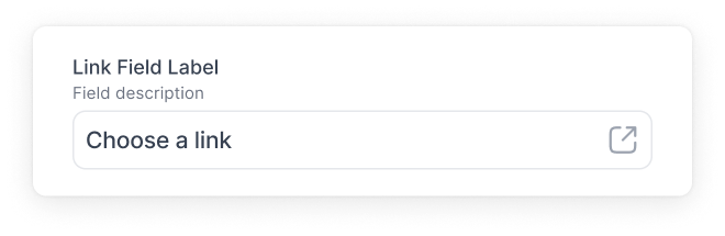
This field can be used to select pages in your storefront or link to external sites.
Interface
  interface LinkField {
    component: 'link'
    name: string
    label: string
    description?: string
    defaultValue?: {
      text: string
      url: string
    }
  }
Example
    {
      component: 'link',
      name: 'linkName',
      label: 'Our company page',
      defaultValue: {
        text: 'Our mission',
        url: '/pages/about-us'
      }
    }
Return
  {
    linkName: {
      "url": "/pages/about-us",
      "text": "Our mission",
      "type": "isExternal",
      "newTab": true
    }
  }
Number Field
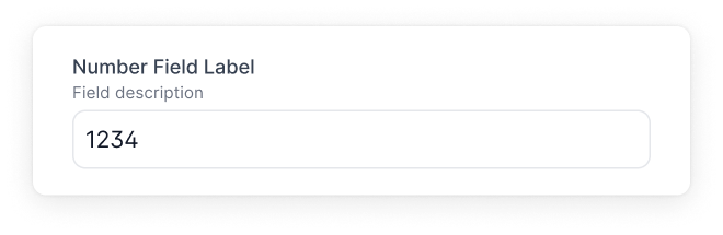
This field accepts a number as an input.
To make the number input a slider, set variant to "slider".
By default, the slider will have a min value of 0 and a max value of 100. To change these values, provide custom values in the validate object.
To enable a range slider, set variant to "slider" and set defaultValue to an array of two numbers.
Interface
  interface NumberField {
    component: 'number'
    name: string
    label: string
    description?: string
    defaultValue?: number | number[]
    validate?: {
      required: boolean
      min: number
      max: number
    } | ((...args: unknown[]) => unknown)
    required?: boolean
    step?: number
    variant?: "input" | "slider" // default is "input"
  }
Example
  {
    component: 'number',
    name: 'productCount',
    label: 'Product Count',
    description: 'How many products in the carousel',
  }
Return
  {
    productCount: 5
  }
Slider Example
  {
    component: 'number',
    name: 'secondsDelay',
    label: 'Seconds Delay',
    description: 'How many seconds for each slide',
    variant: "slider",
    validate: {
      min: 1,
      max: 10,
    }
  }
Return
  {
    secondsDelay: 3
  }
Range Example
  {
    component: 'number',
    name: 'priceRange',
    label: 'Price Range',
    defaultValue: [250, 500],
    variant: "slider",
    validate: {
      min: 0,
      max: 1000,
    }
  }
Return
  {
    priceRange: [500, 750]
  }
Interface
  interface DimensionField {
    component: 'dimension'
    name: string
    label: string
    description?: string
    defaultValue?: {
      value: string
      unit: string
    }
  }
Example
  {
    component: 'dimension',
    name: 'productHeight',
    label: 'Product Height',
    description: 'Height of the product',
  }
Return
  {
    productHeight: {
      "value": "12",
      "unit": "INCHES"
    }
  }
Interface
  interface VolumeField {
    component: 'volume'
    name: string
    label: string
    description?: string
    defaultValue?: {
      value: string
      unit: string
    }
  }
Example
  {
    component: 'volume',
    name: 'productVolume',
    label: 'Product Volume',
    description: 'Volume of the product',
  }
Return
  {
    productVolume: {
      "value": "12",
      "unit": "PINTS"
    }
  }
Interface
  interface WeightField {
    component: 'weight'
    name: string
    label: string
    description?: string
    defaultValue?: {
      value: string
      unit: string
    }
  }
Example
  {
    component: 'weight',
    name: 'productWeight',
    label: 'Product Weight',
    description: 'Weight of the product',
  }
Return
  {
    productWeight: {
      "value": "12",
      "unit": "POUNDS"
    }
  }
Interface
  interface MoneyField {
    component: 'money'
    name: string
    label: string
    description?: string
    defaultValue?: {
      amount?: string | number,
      currencyCode?: "USD" | "EUR" | "GBP" | "CAD"
    }
    validate?: {
      required: boolean
    } | ((...args: unknown[]) => unknown)
    required?: boolean
  }
Example
  {
    component: 'money',
    name: 'price',
    label: 'Price',
    description: 'How much does this product cost?',
  }
Return
  {
    price: {
      amount: "100",
      currencyCode: "USD"
    }
  }
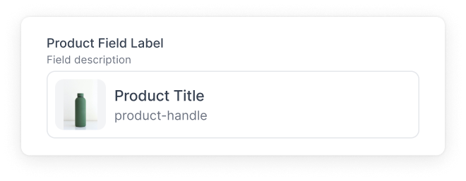
Interface
  interface ProductSearchField {
    component: 'productSearch'
    name: string
    label: string
    description?: string
    validate?: {
      required: boolean
    } | ((...args: unknown[]) => unknown)
    required?: boolean
  }
Example
  {
    component: 'productSearch',
    name: 'upsellProduct',
    label: 'Upsell Product',
    description: 'Select product to upsell',
  }
Return
  {
    upsellProduct: {
        "handle": "the-collection-snowboard-liquid",
        "id": "gid://shopify/Product/8694422569233",
        "data": {
            "title": "The Collection Snowboard: Liquid",
            "handle": "the-collection-snowboard-liquid",
            "images": [
                {
                    "__typename": "ShopifyImage",
                    "originalSrc": "https://cdn.shopify.com/s/files/1/0807/6515/7649/files/photo-1614358536373-1ce27819009e.jpg?v=1691640943"
                },
                {
                    "__typename": "ShopifyImage",
                    "originalSrc": "https://cdn.shopify.com/s/files/1/0807/6515/7649/products/Main_b13ad453-477c-4ed1-9b43-81f3345adfd6.jpg?v=1691620844"
                }
            ],
            "__typename": "ProductData",
            "productType": ""
        },
        "__typename": "Product"
    }
  }
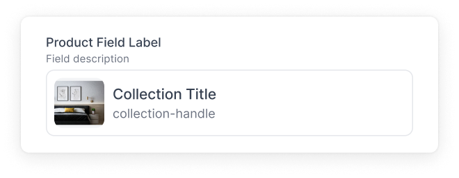
Interface
  interface CollectionsField {
    component: 'collections'
    name: string
    label: string
    description?: string
    validate?: {
      required: boolean
    } | ((...args: unknown[]) => unknown)
    required?: boolean
  }
Example
  {
    component: 'collections',
    name: 'collectionRow',
    label: 'Collection Row',
  }
Return
  {
    collectionRow: {
        "id": "018a67a8-bd21-759f-adc1-a15a8c513f53",
        "title": "On Sale 25%",
        "__typename": "CollectionPage",
        "description": "",
        "sourceCollection": {
            "image": null,
            "__typename": "ShopifyCollection"
        }
    }
  }
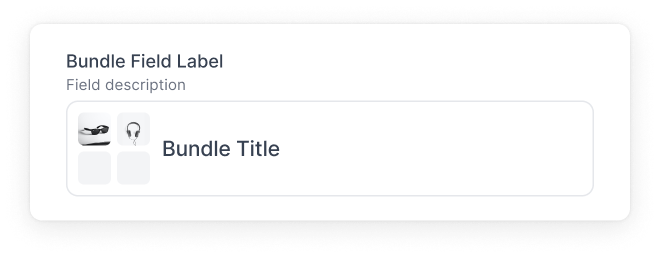
Interface
  interface ProductBundlesField {
    component: 'productBundles'
    name: string
    label: string
    description?: string
  }
Example
  {
    component: 'productBundles',
    name: 'upsellBundle',
    label: 'Upsell Bundle',
    description: 'Select a bundle'
  }
Return
  {
    upsellBundle: {
      "id": "3e014358-1f4d-4b85-a2dc-9f9cede56852",
      "title": "Upsell Bundle",
      "products": [
          {
              "id": "gid://shopify/Product/8694422536465",
              "handle": "selling-plans-ski-wax",
              ...
          },
          {
              "id": "gid://shopify/Product/8694422569233",
              "handle": "the-collection-snowboard-liquid",
              ...
          },
          {
              "id": "gid://shopify/Product/8694422503697",
              "handle": "the-collection-snowboard-oxygen",
              ...
          }
      ],
      "__typename": "Bundle",
      "description": ""
    }
  }
HTML Field
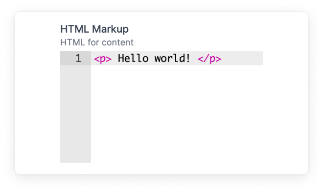
Allows you to write HTML.
This field will return raw HTML. It is important that your component is set up to sanitize and render the markup accordingly.
Interface
  interface HTMLField {
    component: 'html'
    name: string
    label: string
    description?: string
    defaultValue?: string
    validate?: {
      required: boolean
    } | ((...args: unknown[]) => unknown)
    required?: boolean
  }
Example
  {
    component: 'html',
    name: 'markup',
    label: 'HTML Markup',
    description: 'HTML for content',
    defaultValue: '<p> Hello world! </p>',
  }
Return
  {
    markup : "<p> Hello world! </p>"
  }
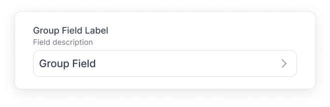
Interface
  interface GroupField {
    component: 'group'
    name: string
    fields: Array<Field>
    label: string
    description?: string
    defaultValue?: object
  }
Example
  {
    component: 'group',
    name: 'details',
    label: 'Your Details',
    description: 'Info about you',
    fields: [
      {
        component: 'text',
        name: 'firstName'
      },
      {
        component: 'number',
        name: 'age'
      },
    ]
    defaultValue: {
      firstName: 'Andrew',
      age: 28
    },
  }
Return
  {
    details : {
      firstName: 'Andrew',
      age: 28
    }
  }
List Field
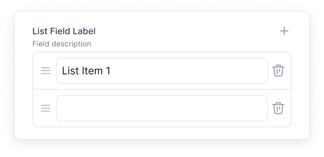
Lets you create a list of a single field type. For example, you can create a list of text fields or number fields.
Interface
  interface ListField {
    component: 'list'
    name: string
    label: string
    fields: {
      component: string
    }
    description?: string
    defaultValue?: Array<any>
    validate?: {
      maxItems?: number
      required?: boolean
    } | ((...args: unknown[]) => unknown)
    required?: boolean
  }
Example
  {
    component: 'list',
    name: 'navLabels',
    label: 'Navigation Labels',
    field: {
      component: 'text',
    },
    defaultValue: ['hello', 'world'],
  }
Return
  {
    navLabels : [
      'hello',
      'world'
    ]
  }
Group List Field
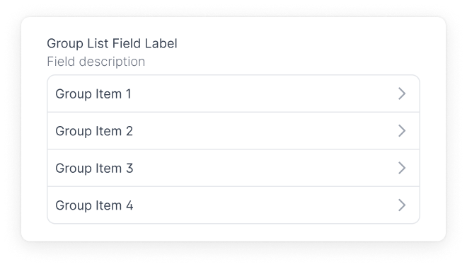
Lets you create a list of groups. For example, you can create a list of groups that holds a text field, number field, and product bundle field.
The itemProps.label configuration allows you to give readable values that appear in the list. In the example below:
label: "Friend: {{item.firstName}}"
You can choose any accessor name in the list of fields for this group like lastName or number.
Interface
  interface GroupListField {
    component: 'group-list'
    name: string
    label: string
    fields: Array<Field>
    description?: string
    defaultValue?: Array<any>
    itemProps?: {
      label: string
    } | ((...args: unknown[]) => unknown)
    validate?: {
      maxItems?: number
      required?: boolean
    } | ((...args: unknown[]) => unknown)
    required?: boolean
  }
Example
  {
    component: 'group-list',
    name: 'friends',
    label: 'My Friends',
    itemProps: {
      label: "Friend: {{item.firstName}}"
    },
    fields: [
      {
        component: 'text',
        name: 'firstName',
        label: 'First Name'
      },
      {
        component: 'text',
        name: 'number',
        label: 'Phone Number'
      },
    ],
    defaultValue: [
      {
        firstName: 'John',
        number: '(777) 777-7777'
      }
    ],
  }
Return
  {
    friends : [
        {
            "firstName": "John",
            "number": "(777) 777-7777"
        },
        {
            "firstName": "Jane",
            "number": "(333) 333-3333"
        },
    ]
  }
Blocks Field
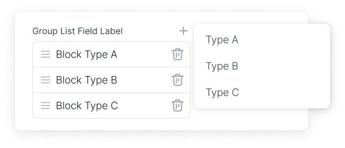
Blocks is a flexible field that let you create a set of unique fields, making it easy to build a variety of components. For example, you can use them to quickly create a customizable form with different types of inputs, or to put together a content section with various elements like images or accordions. This system simplifies the process of designing and arranging components to suit your specific requirements.
Nested sections
Setting the optional sectionTypes property on a blocks field lets editors add whole sections as blocks — alongside any inline templates you define. This enables the Nested Sections feature in the customizer.
Each entry in sectionTypes must match the key of a registered section schema in your storefront. The customizer's block picker will surface those section types as options, and editors can also use "Insert from Library" to embed existing sections. Nested sections can be nested up to three levels deep.
Rendering nested sections
When the parent section is fetched, nested-section refs are inlined into its blocks array. Walk the array and dispatch by _template:
- Registered section types (from
sectionTypes) — render with<RenderSection section={block} />from@pack/react. It looks up the component in the registry populated byregisterSection. - Inline templates (from the field's
templatesmap) — render those explicitly; they aren't registered sections.
Requires @pack/react@^4.3.0.
Interface
  interface BlocksField {
    component: 'blocks'
    name: string
    label: string
    fields: Array<Field>
    description?: string
    templates: {
      [string]: {
        label: string,
        key: string,
        fields: Array<Field>,
      }
    }
    /** Optional. Section schema keys that editors can embed as blocks. */
    sectionTypes?: string[]
  }
Example
  {
    component: 'blocks',
    name: 'varietyList',
    label: 'List Of Things',
    templates: {
      human: {
        label: 'Human Thing',
        key: 'human',
        itemProps: {
          label: 'Human says : {{item.noise}}',
        },
        fields: [
          {
            label: 'Noise',
            name: 'noise',
            component: 'text',
          },
        ]
      },
      cat: {
        label: 'Cat Thing',
        key: 'cat',
        itemProps: {
          label: 'Cat says : {{item.noise}}',
        },
        fields: [
          {
            label: 'Noise',
            name: 'noise',
            component: 'text',
          },
        ]
      },
      dog: {
        label: 'Dog Thing',
        key: 'dog',
        itemProps: {
          label: 'Dog says : {{item.noise}}',
        },
        fields: [
          {
            label: 'Noise',
            name: 'noise',
            component: 'text',
          },
        ]
      },
    }
  }
Nested Sections Example
  {
    component: 'blocks',
    name: 'contentBlocks',
    label: 'Content Blocks',
    sectionTypes: ['promo-banner', 'feature-card'],
    templates: {
      heading: {
        label: 'Heading',
        key: 'heading',
        fields: [
          {
            label: 'Text',
            name: 'text',
            component: 'text',
          },
        ],
      },
    },
  }
Return
{
  varietyList: [
      {
          "_template": "human",
          "noise": "Gah"
      },
      {
          "_template": "cat",
          "noise": "meow"
      },
      {
          "_template": "dog",
          "noise": "bark bark"
      }
  ]
}
Rendering Nested Sections
import {RenderSection} from '@pack/react';
import {Link} from '~/components/Link';

export function NestedBlock({block}) {
  const {_template: type} = block;

  // Inline templates — handled explicitly.
  if (type === 'heading') {
    return <h2 className={block.size || 'text-h3'}>{block.text}</h2>;
  }
  if (type === 'button') {
    return (
      <Link to={block.link?.url} newTab={block.link?.newTab}>
        {block.link?.text}
      </Link>
    );
  }

  // Registered section types — looked up via the section registry.
  return <RenderSection section={block} />;
}
Toggle Field
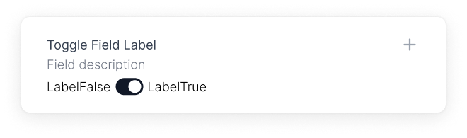
The Toggle Field is a boolean toggle. You can set its value for content that needs a true and or false state.
Interface
  interface ToggleField {
    component: 'toggle'
    name: string
    label: string
    toggleLabels?: {
      true?: string | boolean,
      false?: string | boolean
    }
    description?: string
    defaultValue?: boolean
  }
Example
  {
    component: 'toggle',
    name: 'amICool',
    label: 'Am I Cool?',
    toggleLabels: {
        true: 'Yah',
        false: 'Nah',
    },
    defaultValue: false,
  }
Return
  {
    amICool : false
  }
Select Field
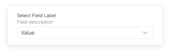
This is a select / dropdown input field. It will return the value of your selected option.
Interface
  interface SelectField {
    component: 'select'
    name: string
    label: string
    options?: Array<
      {
        label: string,
        value: string
      }
    >
    description?: string
    defaultValue?: string
  }
Example
  {
    component: 'select',
    name: 'bundleQty',
    label: 'Bundle Qty',
    options: [
      {
        label: 'One Pack',
        value: 'one-pack-sku'
      },
      {
        label: 'Two Pack',
        value: 'two-pack-sku'
      },
      {
        label: 'Three Pack',
        value: 'three-pack-sku'
      },
    ],
    defaultValue: 'three-pack-sku',
  }
Return
  {
    bundleQty : 'two-pack-sku'
  }
Radio Group Field
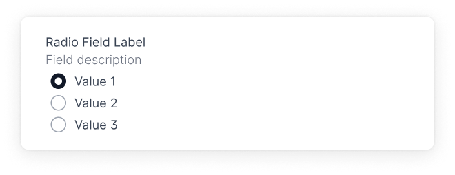
This is a field of radio inputs. Returns the value of your selected option. This field also has the option to be displayed vertically or horizontally, or as radios or buttons.
Interface
  interface RadioGroupField {
    component: 'radio-group'
    name: string
    label: string
    options?: Array<
      {
        label: string,
        value: string
      }
    >
    description?: string
    defaultValue?: string
    variant?: "radio" | "button"
    direction?: "vertical" | "horizontal"
  }
Example
  {
    component: 'radio-group',
    name: 'radioName',
    label: 'Radio Group Field',
    description: 'A radio field',
    options: [
      {
        label: 'Yes',
        value: 'yesValue'
      },
      {
        label: 'Maybe',
        value: 'maybeValue'
      },
      {
        label: 'No',
        value: 'noValue'
      },
    ],
    defaultValue: 'maybeValue',
  }
Return
  {
    radioName : 'maybeValue'
  }
Tags Field
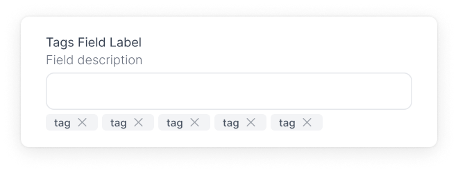
This field will render an input where you can create tags by inputting your tag and hitting enter. The return value will be an array of strings.
Interface
  interface TagsField {
    component: 'tags'
    name: string
    label: string
    description?: string
    defaultValue?: Array<string>
  }
Example
  {
    name: 'tagsName',
    label: 'Tags Field',
    component: 'tags',
    defaultValue: ['default-tag-1', 'default-tag-2'],
  }
Return
  {
    tagsName : ['default-tag-1', 'default-tag-2']
  }

Interface
  interface ColorField {
    component: 'color'
    name: string
    label?: string
    description?: string
    colorFormat?: 'hex' | 'rgb' // Defaults to "hex"
    colors?: string[]
    widget?: 'sketch' | 'block' // Defaults to "sketch
    defaultValue?: Array<string>
  }
Example
  {
    component: 'color',
    name: 'colorName',
    label: 'Color Field',
    description: 'Pick a color',
    colorFormat: 'hex',
    colors: ['#FF0000', '#00FF00', '#0000FF'],
    widget: 'sketch',
    defaultValue: "#00FF00",
  }
Return
  {
    color : "#00FF00"
  }

Interface
  interface DateField {
    component: 'date'
    name: string
    label: string
    description?: string
    timeFormat?: boolean | string // Accepts Moment.js date format
    dateFormat?: boolean | string // Accepts Moment.js date format
  }
Example
  {
    component: 'date',
    name: 'date',
    label: 'Date',
    timeFormat: true,
    dateFormat: 'MM/DD/YYYY',
  }
Return
  {
    date : "2021-09-01T00:00:00.000Z"
  }