Blueprint for storefronts sections
Sections are modular reusable components that enable swift incorporation of pre-designed content templates into your pages. website. Pack's Blueprint theme comes with a variety of premade sections that you can use to build out your storefront. Learn more about sections and how to manage them here.
Container Settings
When you add a new section to a page in Customizer, you can configure the section's container settings. These settings are unique to each section and allow you to customize the content and layout of the section.
- Background color: Choose a background color for the section.
- Padding: Add padding to the section's content.
- Bottom margin: Add a bottom margin to the section.
- Top padding (tablet/desktop): Add additional top padding to the section on tablet and desktop devices.
- Bottom padding (tablet/desktop): Add additional bottom padding to the section on tablet and desktop devices.
- Bottom margin (tablet/desktop): Add a bottom margin to the section on tablet and desktop devices.
- Top padding (mobile): Add additional top padding to the section on mobile devices.
- Bottom padding (mobile): Add additional bottom padding to the section on mobile devices.
- Bottom margin (mobile): Add a bottom margin to the section on mobile devices.
Section Settings
Section settings are unique to each section and allow you to customize the content and layout of the section. These settings can include:
- Above The Fold: Controls whether the section's heading is set as an H1 tag, typically used for the primary section on a page.
- Full Width and Full Bleed: Toggles that remove any width or padding constraints on the section, making it span the full width of the page.
- Height: Customizable height settings for desktop and mobile, allowing for static heights or aspect ratios, with options to set minimum and maximum heights.
Product
Shoppable Social Video
The Shoppable Social Video section allows you to display a video with a slider of associated products that viewers can shop from. The section is customizable with various settings for the video, products, slider, text, and background.
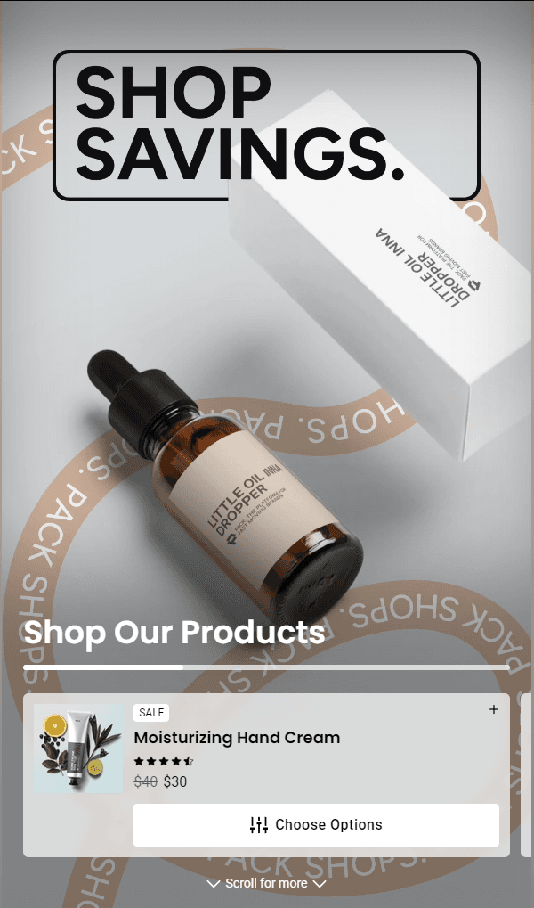
Section Fields:
-
Products:
- Product: The product to display, selectable through a product search.
- Image: An image to override the product's featured image.
- Badge Text: Text displayed as a badge on the product card.
- Short Description: A brief description displayed when the product card is expanded.
-
Video Settings:
- Video URL: The direct link to the video file.
- Poster Image: The image shown as the video poster while the video loads.
-
Product Settings:
- Enable Star Rating: Toggle to display a star rating on the product card.
- Enable Quantity Selector: Toggle to display a quantity selector.
- Choose Options Button Text: Text for the button when a product has options.
- Choose Options Button Style: Style for the options button.
- Add To Cart Button Text: Text for the 'Add To Cart' button.
- Add To Cart Button Style: Style for the 'Add To Cart' button.
- Notify Me Text: Text for the 'Notify Me' button when the product is out of stock.
- View Product Text: Text for the 'View Product' button.
- Badge Background Color: Background color for the badge.
- Badge Text Color: Text color for the badge.
-
Slider Settings:
- Enable Scrollbar: Toggle to enable a scrollbar if more than one product is displayed.
- Scrollbar Color: The color of the scrollbar.
- Slide Background Color: Background color for each slide.
- Slide Background Opacity: Opacity level for the slide background (0 to 1.0).
- Slide Background Blur (px): Blur effect for the slide background.
- Slide Text Color: Text color for the product information on the slide.
-
Text Settings:
- Heading: The heading text for the section.
- Subtext: The subtext displayed below the product slider, supports markdown.
- Scroll For More Text: Text displayed on the scroll button.
- Text and Icon Color: Color for any text and icons overlaying the video.
-
Background Settings:
- Color Type: The type of background color (Solid or Gradient).
- First Color: The primary color for the background.
- Second Color (optional): The secondary color for the gradient.
- Third Color (optional): The tertiary color for the gradient.
Product
The Product section allows you to display a specific product on your page, complete with all the details and options available for purchase. This section fetches the product data either from the CMS or directly from the Shopify store, ensuring that the product is active and available on the Hydrogen sales channel.
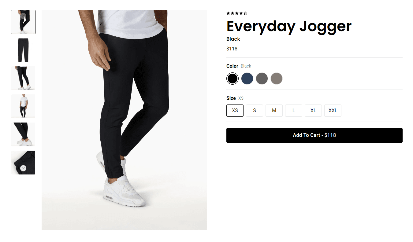
Section Fields:
- Product:
- Product: Select the product to display using the product search. The product must be active and available on the Hydrogen sales channel.
Products Grid
The Products Grid section displays a grid of products that are fetched dynamically based on their handles. This section allows you to showcase a collection of products in a customizable grid layout with options for star ratings and other product details.
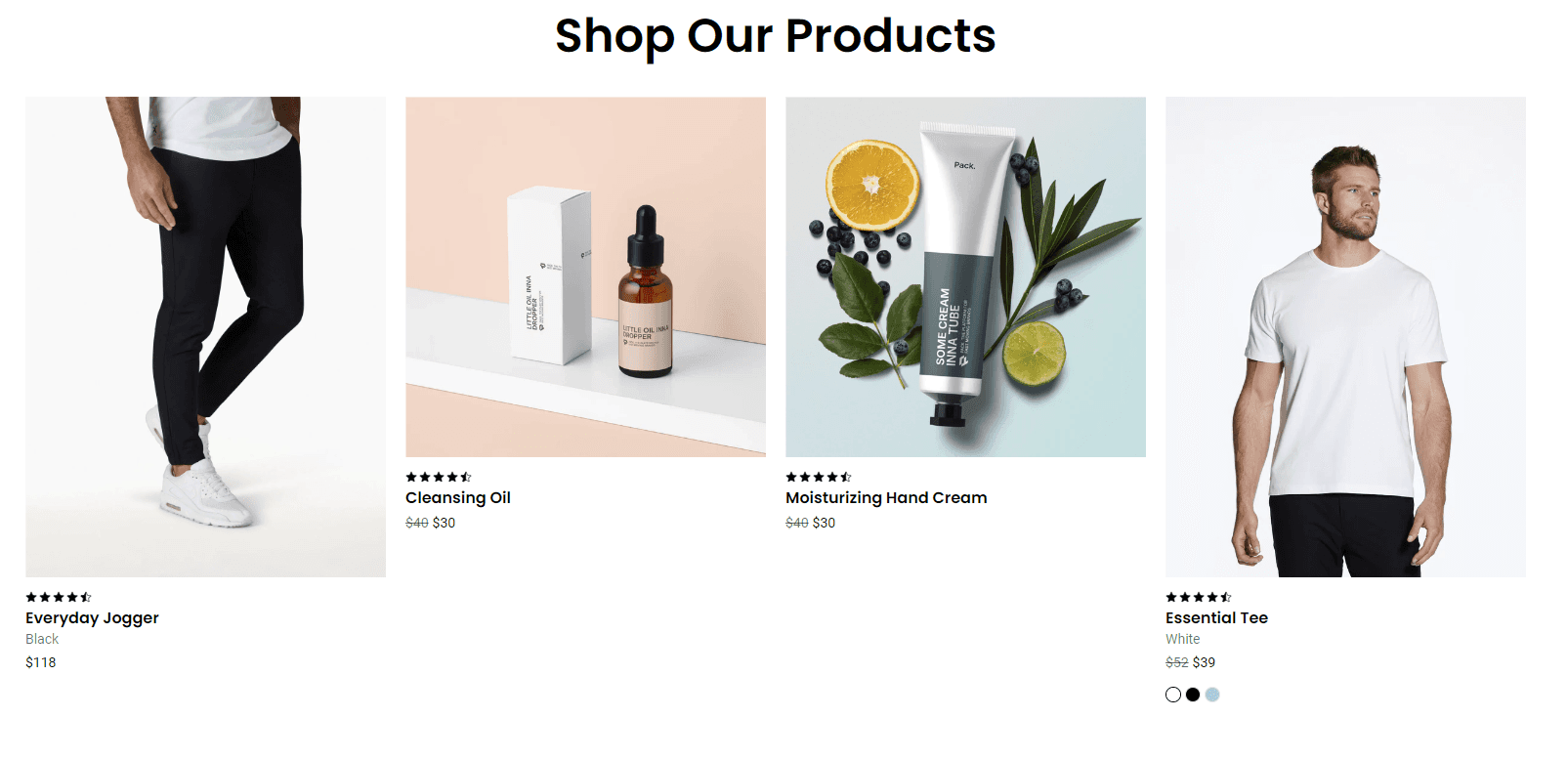
Section Fields:
-
Heading:
- You can set a heading for the products grid section.
-
Products:
- Product: Select the products to display using the product search. The products must be active and available on the Hydrogen sales channel.
-
Grid Settings:
- Columns (desktop): Select the number of columns to display on desktop devices.
- Columns (tablet): Select the number of columns to display on tablet devices.
- Columns (mobile): Select the number of columns to display on mobile devices.
-
Product Item Settings:
- Enable Star Rating: Toggle to show or hide the star ratings for products. Note: For the actual star rating, API logic must be first implemented in the ProductStars component. Otherwise, the manual rating set in site settings will be displayed.
Products Slider
The Products Slider section displays a slider of products fetched dynamically based on their handles. This section allows you to showcase a collection of products in a customizable slider format with options for star ratings, slider styles, and more.
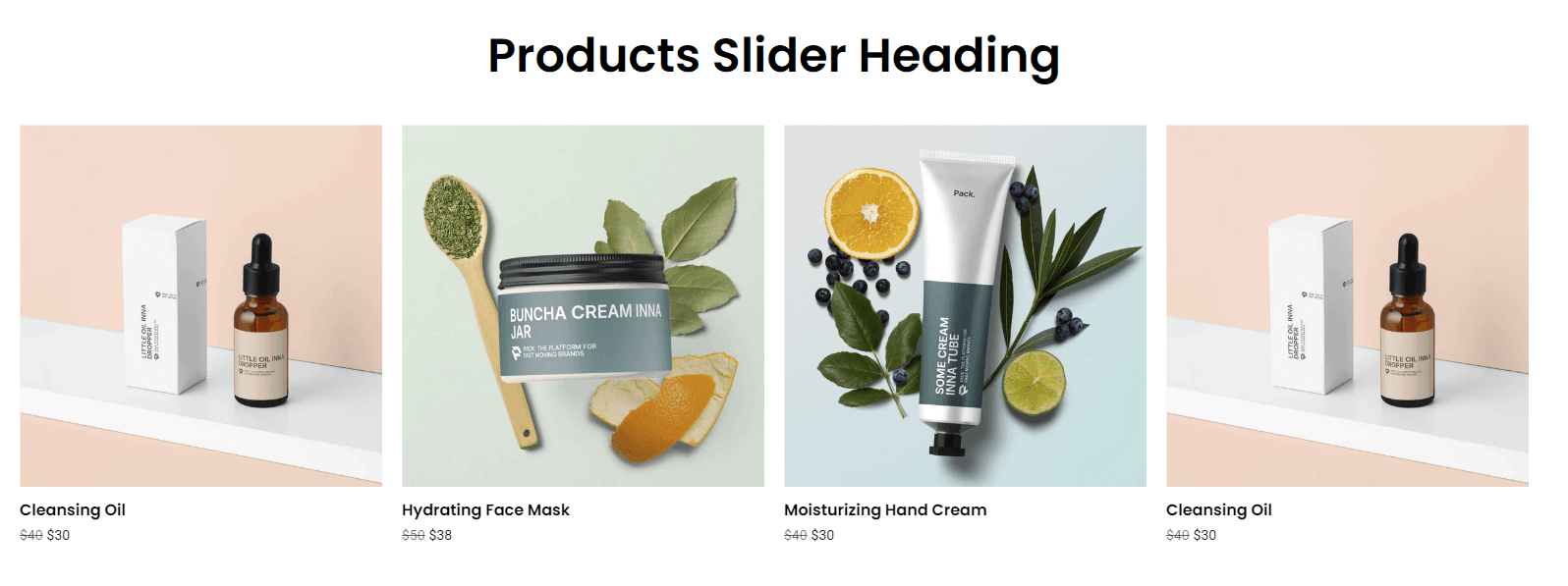
Section Fields:
-
Heading:
- You can set a heading for the products slider section.
-
Products:
- Product: Select the products to display using the product search. The products must be active and available on the Hydrogen sales channel.
-
Footer Button:
- Link: Option to add a button that can link to an external URL or a product modal. To link to a product modal, format the URL as
?product=<product-handle>.
- Link: Option to add a button that can link to an external URL or a product modal. To link to a product modal, format the URL as
-
Product Item Settings:
- Enable Star Rating: Toggle to show or hide the star ratings for products. Note: For the actual star rating, API logic must be first implemented in the ProductStars component. Otherwise, the manual rating set in site settings will be displayed.
-
Slider Settings:
- Slider Style: Choose the style of the slider. Options include contained, contained with loop, full bleed, full bleed with gradient. Note: Loop and centered settings apply only if the number of products is at least twice the number of slides per view.
- Slides Per View (desktop): Set the number of slides visible on desktop devices.
- Slides Per View (tablet): Set the number of slides visible on tablet devices. You can use decimals to show partial slides.
- Slides Per View (mobile): Set the number of slides visible on mobile devices. You can use decimals to show partial slides.
-
Section Settings:
- Button Style: Customize the style of the footer button.
- Full Width: Toggle to remove the max width limitation, allowing the slider to span the full width of the container.
Text
Accordions
The Accordion section creates collapsible sections.
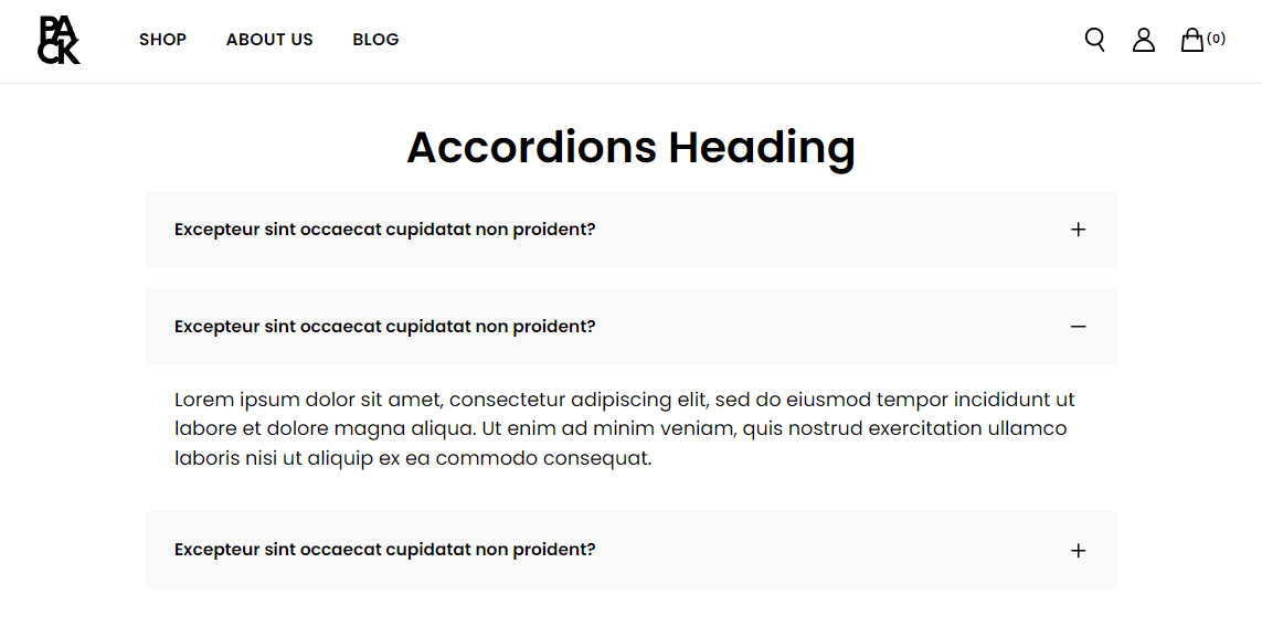
Section Fields:
- Heading: Text input for the accordion's main heading.
- Accordions: A group list field where you can add multiple accordion items. Each item includes:
- Header: The text displayed in the accordion's header.
- Body: The Markdown content displayed when the accordion is expanded.
- Default Open: A toggle to set whether the accordion is open by default.
- Accordion Header Background Color: A dropdown to select the background color of the accordion header.
- Accordion Header Text Color: A dropdown to select the text color of the accordion header.
Form Builder
The Form Builder section allows you to create customizable forms with various input fields and options, enabling the collection of user data directly on your site. It's equipped with features like Google reCAPTCHA for spam protection and supports multiple input types, including text, email, phone, and file uploads.
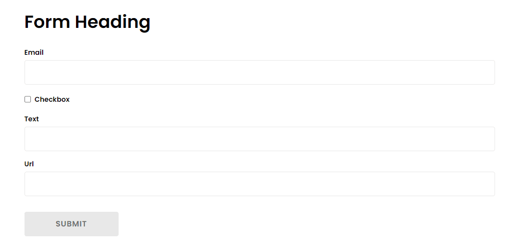
Section Fields:
-
Form Endpoint:
- You set the endpoint where the form data will be submitted. The submit button is disabled until this is provided.
-
Heading:
- You can set a heading for the form.
-
Fields:
- You can add various input fields like text, email, phone, etc. Each field can be customized with options like label, placeholder, and whether it's required.
-
Submit Button Text:
- You can customize the text displayed on the form's submit button.
-
reCAPTCHA v2 Enabled:
- You can enable Google reCAPTCHA v2 for the form.
Icon Row
The Icon Row section allows you to display a row of icons or images with accompanying labels, typically used to highlight key features or benefits. This section is customizable, letting you choose from a set of predefined icons or upload your own images.
Section Fields:
-
Heading:
- You can set a heading for the Icon Row section.
-
Subtext:
- You can add a markdown-supported subtext below the heading.
-
Icons:
- You can configure each icon or image with options to select from predefined icons, upload a custom image, set alternative text, and label the icon or image.
Markdown
The Markdown section allows you to add rich text content to your page using Markdown editor.
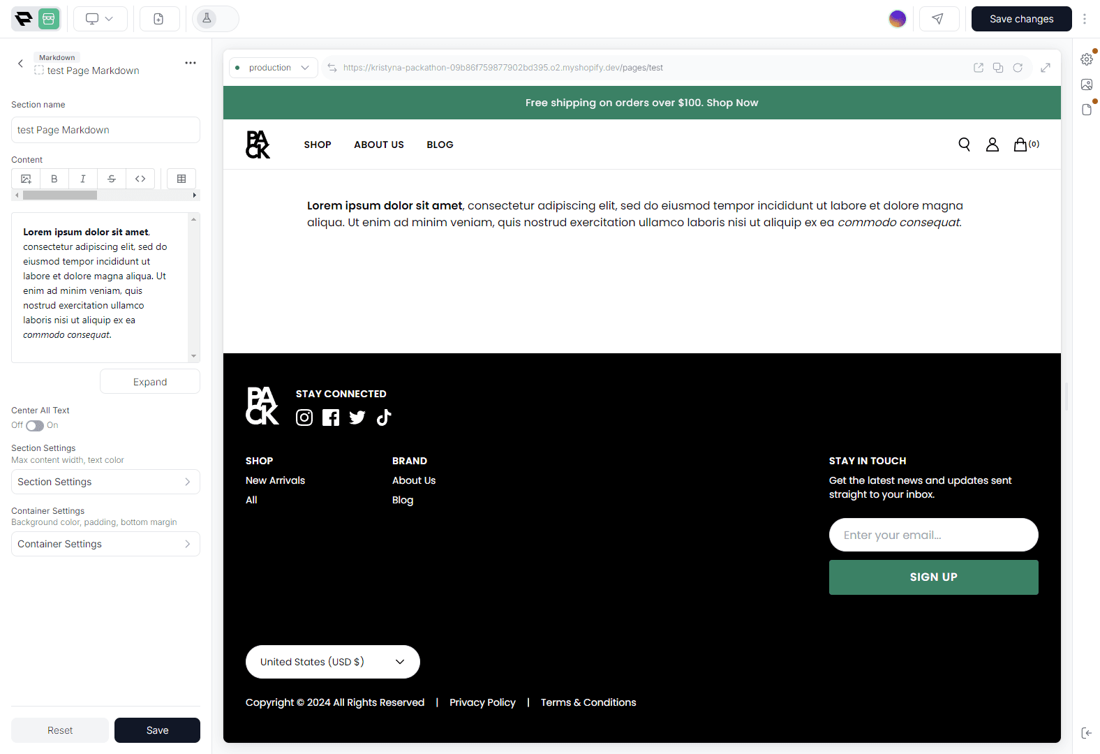
Section Fields:
-
Content:
- You can enter your text using Markdown editor.
-
Center All Text:
- You can toggle whether the text should be centered within the section.
Text Block
The Text Block section allows you to add a heading, subtext, and buttons in a simple, centered layout. It's useful for highlighting key messages or calls to action on your site.

Section Fields:
-
Heading:
- You can set a heading for the text block.
-
Subtext:
- You can add a markdown-supported subtext below the heading.
-
Buttons:
- You can configure up to two buttons with customizable links and styles.
Heros
Hero Banner
The Hero Banner section is designed to display a large, visually impactful banner with customizable content, images, and layout options. It's highly configurable, allowing different setups for desktop and mobile views.

Section Fields:
-
Image Settings:
- You can configure different images for desktop and mobile devices.
- Options include setting alternative text, and positioning for images on both desktop and mobile.
-
Text Settings:
- This allows you to set the banner's heading, subheading, and text color.
- You can also add up to two buttons with customizable styles and links.
-
Content Settings:
- You can enable a dark overlay on the banner image, adjust the position and alignment of the content, and set the maximum width for both desktop and mobile views.
Half Hero
The Half Hero section combines media (images or video) and text content, split across two columns. This section is versatile and allows for different layouts and content alignments depending on your needs.
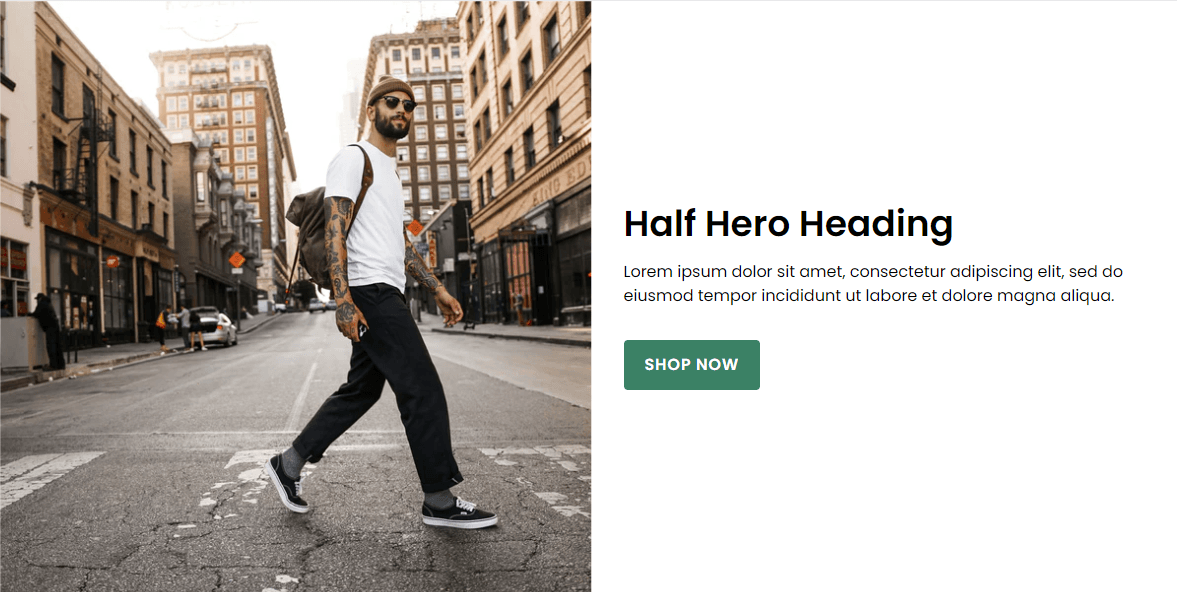
Section Fields:
-
Media Settings:
- You can configure image and video settings, including upload options, crop positions, aspect ratios, and order of media display on different devices.
-
Content Settings:
- You can set a heading, subtext, superheading, and buttons. The content can be aligned differently on desktop and mobile devices, with options to adjust the maximum width and text color.
Hero Slider
The Hero Slider section allows you to create a dynamic hero banner with multiple slides, each containing images, videos, text, and buttons. It's designed to highlight key content in a visually impactful way, with options for autoplay and various transition effects.

Section Fields:
-
Slides:
- You can configure each slide individually with options for images, videos, text, and buttons. Each slide can have a unique setup for desktop and mobile.
-
Slider Settings:
- You can control the slider behavior, including autoplay, delay between transitions, transition effects, and the appearance of pagination bullets.
Bundles
Build Your Own Bundle
The Build Your Own Bundle section allows you to create a customizable bundle by selecting products from different groupings. This section is designed to provide a flexible bundling experience with options to apply discounts at various tiers.
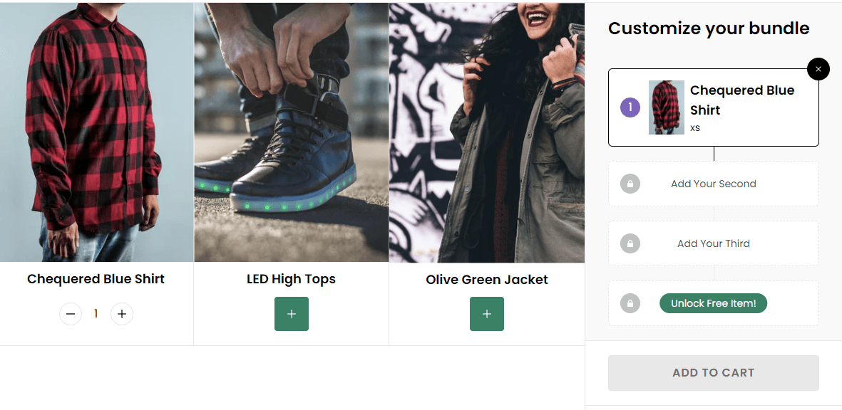
Section Fields:
-
Product Groupings:
- Group products into categories. You can create multiple groupings, and each grouping will appear in the bundle builder.
-
Tiers:
- Set up different discount tiers. Each tier can apply a discount type, such as a percentage off or a free item, based on the number of products added to the bundle.
-
Summary Heading Default:
- Set the default heading for the bundle summary before any discount tier is met.
-
Preselected Products:
- Optionally, preselect products to be included in the bundle by default. Only products that are part of a product grouping will be preselected.
HTML
HTML
The HTML section allows you to include custom HTML content within your page.
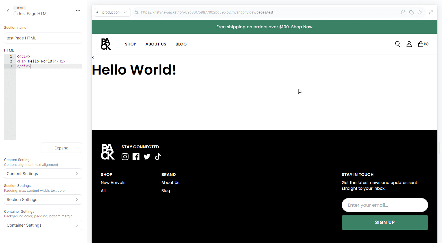
Section Fields:
-
HTML:
- Add your custom HTML content here. This field accepts raw HTML.
-
Content Settings:
- Adjust the alignment of the content and text within the section.
Media
Image
The Image section allows you to display images with customizable settings for desktop and mobile devices, including optional links and captions.
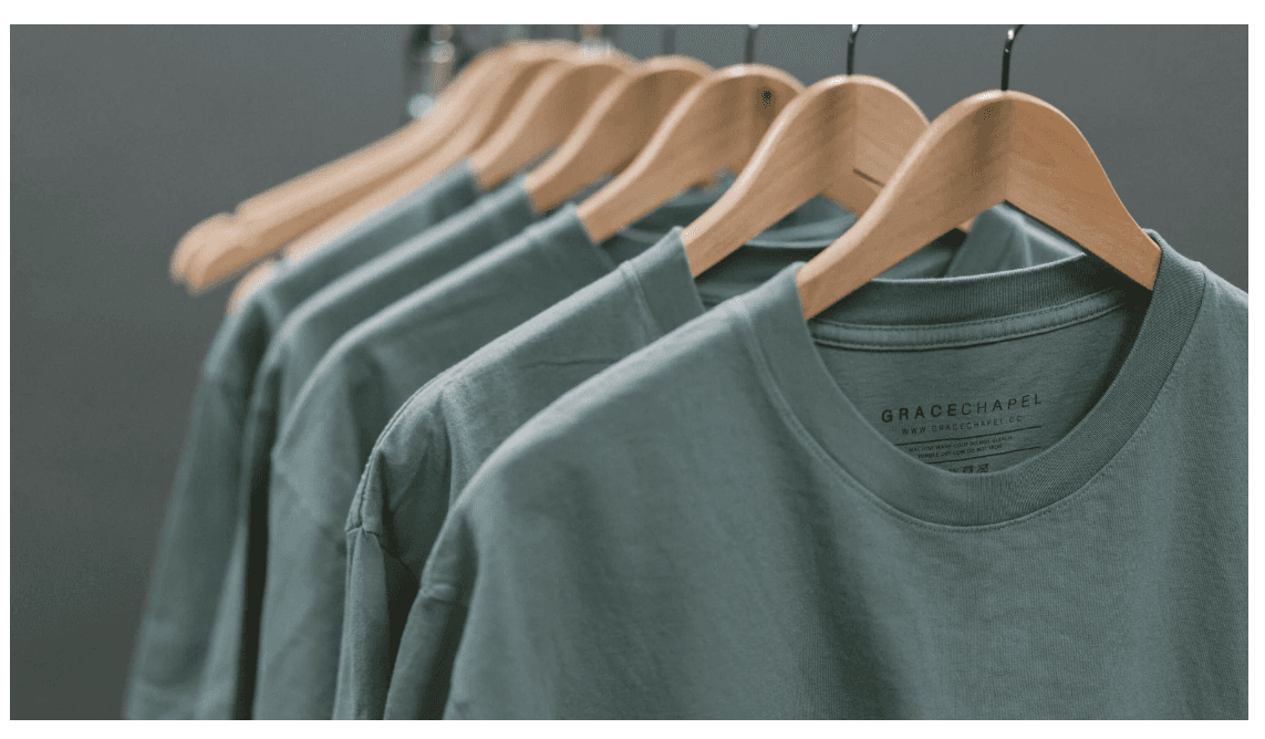
Section Fields:
-
Image Settings:
- Configure the image for both tablet/desktop and mobile devices.
- Options include setting the aspect ratio and crop position.
-
Content Settings:
- Add an optional link to make the image clickable.
- Include an optional caption below the image.
Image Tiles Slider
The Image Tiles Slider section allows you to create a responsive image slider with customizable settings, including the number of tiles per view, aspect ratio, and button styles.
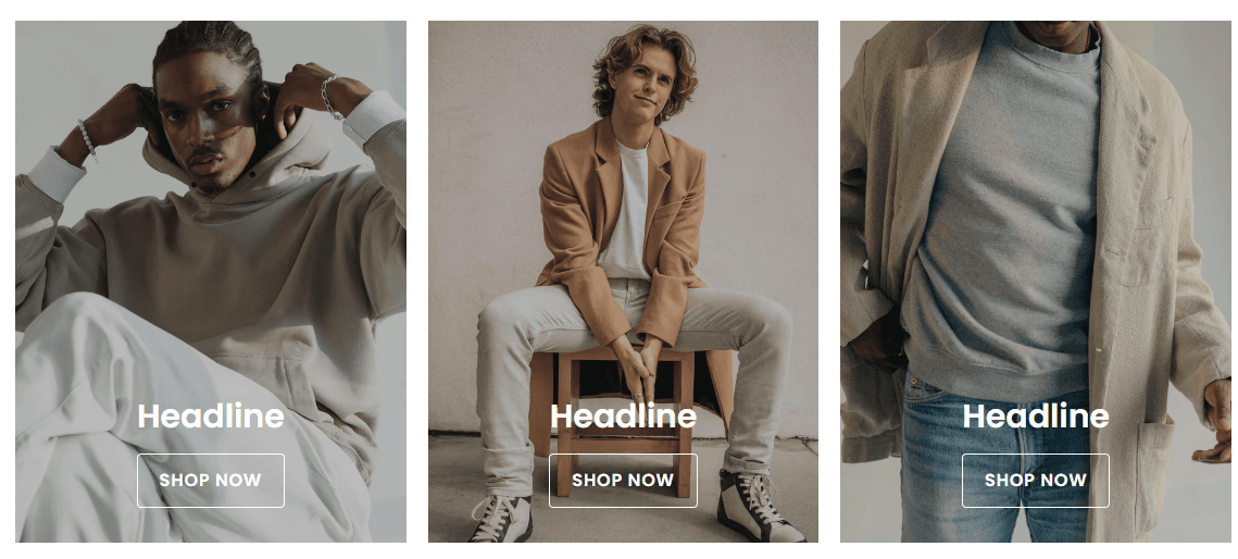
Section Fields:
-
Header Settings:
- Customize the heading, subheading, and alignment of the section header.
-
Tiles:
- Configure individual image tiles, including image settings, heading, and buttons.
- Set up to two buttons per tile, with options to make the image clickable.
-
Content Settings:
- Control the appearance of the content overlay, button styles, and content alignment.
-
Section Settings:
- Adjust the number of tiles visible per view on different screen sizes, the image aspect ratio, and the section's width.
Image Tiles Grid
The Image Tiles Grid section allows you to create a responsive grid of image tiles with customizable settings, including the number of columns, grid spacing, and content alignment.
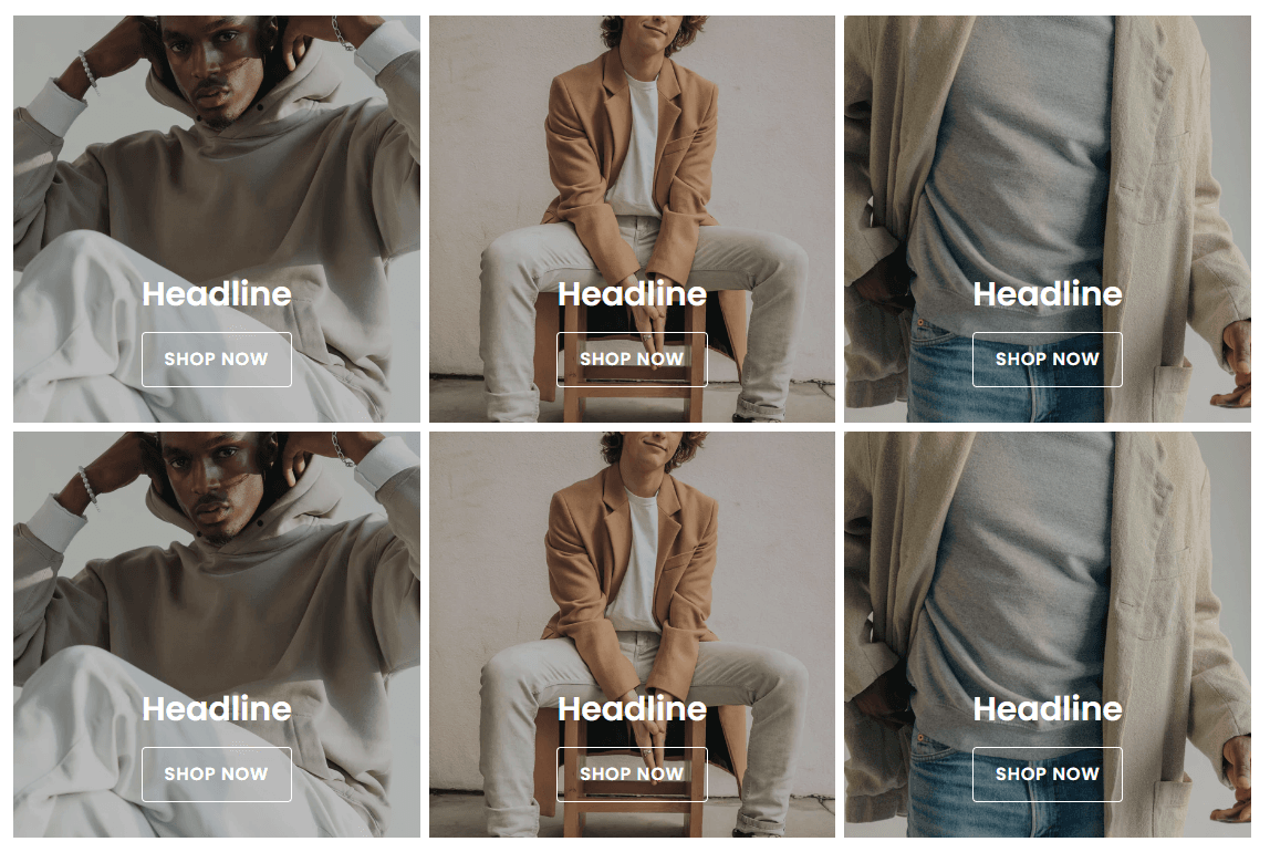
Section Fields:
-
Header Settings:
- Customize the heading, subheading, and alignment of the section header.
-
Tiles:
- Configure individual image tiles, including image settings, heading, and buttons.
- Set up to two buttons per tile, with options to make the image clickable.
-
Content Settings:
- Control the appearance of the content overlay, button styles, and content alignment.
-
Section Settings:
- Adjust the number of grid columns and spacing on different screen sizes, the image aspect ratio, and the section's width.
Image Tiles Mosaic
The Image Tiles Mosaic section enables the creation of a grid with a mosaic layout, featuring customizable primary and grid tiles. This section allows you to configure various display options for different screen sizes.
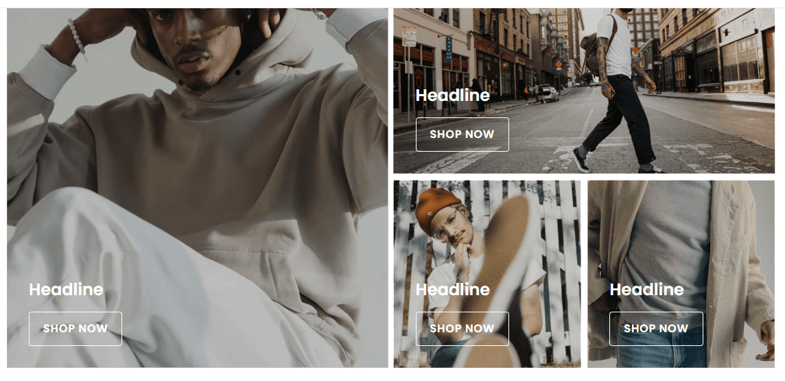
Section Fields:
-
Header Settings:
- Customize the heading, subheading, and alignment of the section header.
-
Primary Tile:
- Configure the primary tile, including its placement relative to the grid, aspect ratios for different screen sizes, and content.
-
Grid Tiles:
- Select a grid layout and configure individual grid tiles. You can customize their aspect ratios for mobile and content.
-
Content Settings:
- Control overlay appearance, content position and alignment, tile heading size, and the option to make the image clickable.
Social Images Grid
The Social Images Grid section allows you to display a grid of images, each linked to a corresponding social media post. This grid is designed to feature four images, and each image is overlaid with a platform-specific icon.

Section Fields:
-
Images:
- Image Alt: Alt text for the image.
- Image: The image itself, selected from the media manager.
- Platform: Select the social media platform (e.g., Instagram, Facebook, etc.).
- Social Post URL: The URL to the social media post.
-
Section Settings:
- Full Width: Option to remove the max width constraint for the section.
- Full Bleed: Option to remove padding around the section, making the images flush with the edges.
Tabbed Tiles Slider
The Tabbed Tiles Slider section allows you to create a dynamic and interactive slider with multiple tabs, each containing a set of tiles. Users can switch between tabs to view different sets of content.
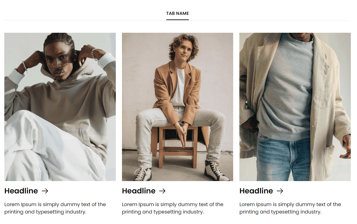
Section Fields:
-
Header Settings:
- Heading: Main heading for the section.
- Subheading: Optional subheading for the section.
- Alignment: Control the alignment of the heading and subheading.
-
Tabs:
- Tab Name: Name displayed on the tab.
- Tiles: Each tab can contain multiple tiles, with fields for:
- Image Alt: Alt text for the image.
- Image: Image displayed on the tile.
- Image Crop Position: Position of the image crop.
- Heading: Heading for the tile.
- Description: Optional description text for the tile.
- Link: Optional link associated with the tile.
-
Footer Button:
- Text: The text for the button.
- URL: The URL the button links to.
- New Tab: Option to open the link in a new tab.
- Type: Type of the link.
-
Section Settings:
- Tiles Per View: Configure how many tiles are displayed per view on desktop, tablet, and mobile.
- Image Aspect Ratio: Select the aspect ratio for the images.
- Text Color: Set the text color for the section.
- Tile Text Alignment: Control the alignment of the text within each tile.
- Tile Heading Size: Adjust the size of the tile headings.
- Footer Button Style: Choose the style of the footer button.
- Full Width: Option to make the section full width, removing the max-width constraint.
Tiles Slider
The Tiles Slider section allows you to showcase a series of tiles in a slider format. It offers various customization options for tile content, layout, and appearance.
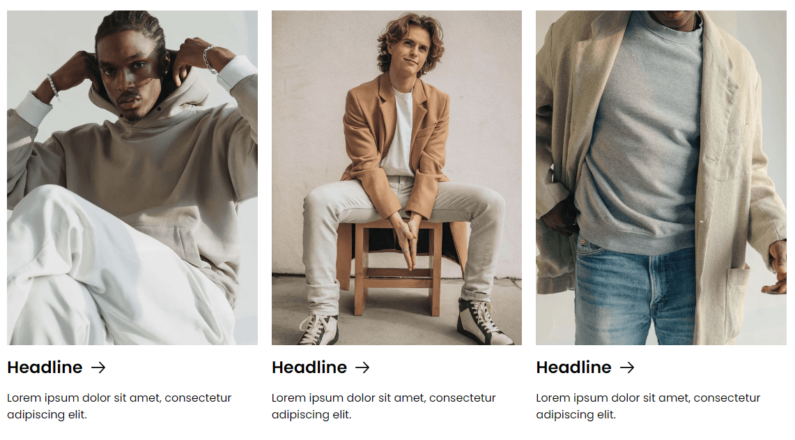
Section Fields:
-
Header Settings:
- Heading: Main heading for the section.
- Subheading: Optional subheading for the section.
- Alignment: Controls the alignment of the heading and subheading.
-
Tiles:
- Image Alt: Alt text for the image.
- Image: Image displayed on the tile.
- Image Crop Position: Position of the image crop.
- Heading: Heading text for the tile.
- Description: Optional description text for the tile.
- Link: Optional link associated with the tile.
-
Footer Button:
- Text: The text for the button.
- URL: The URL the button links to.
- New Tab: Option to open the link in a new tab.
- Type: Type of the link.
-
Section Settings:
- Tiles Per View: Configure how many tiles are displayed per view on desktop, tablet, and mobile.
- Image Aspect Ratio: Select the aspect ratio for the images.
- Text Color: Set the text color for the section.
- Tile Text Alignment: Control the alignment of the text within each tile.
- Tile Heading Size: Adjust the size of the tile headings.
- Footer Button Style: Choose the style of the footer button.
- Full Width: Option to make the section full width, removing the max-width constraint.
Tiles Stack
The Tiles Stack section allows you to showcase a vertical stack of tiles with customizable content, layout, and appearance options.
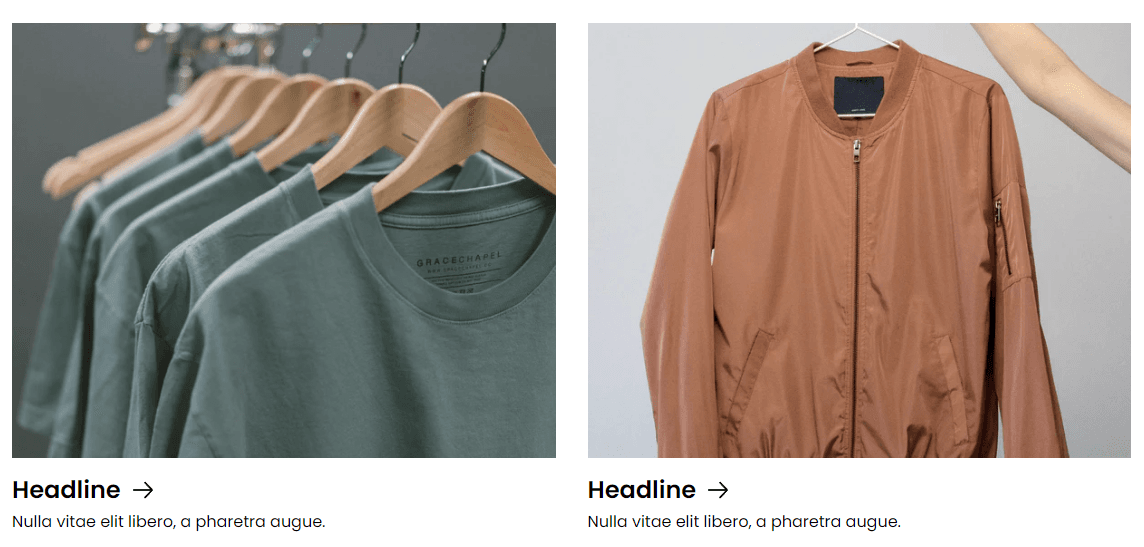
Section Fields:
-
Header Settings:
- Heading: The main heading for the section.
- Subheading: Optional subheading for the section.
- Alignment: Controls the alignment of the heading and subheading.
-
Tiles:
- Image Alt: Alt text for the image.
- Image: Image displayed on the tile.
- Image Crop Position: Position of the image crop.
- Heading: Heading text for the tile.
- Description: Optional description text for the tile.
- Link: Optional link associated with the tile.
-
Section Settings:
- Image Aspect Ratio: Select the aspect ratio for the images.
- Text Color: Set the text color for the section.
- Tile Text Alignment: Control the alignment of the text within each tile.
- Tile Heading Size: Adjust the size of the tile headings.
- Full Width: Option to make the section full width, removing the max-width constraint.
Video
The Video section is designed to embed videos with customizable settings, including autoplay, looping, controls, and optional links.
Section Fields:
-
Media Settings:
- Video Title: The title of the video, used for accessibility.
- Video URL (tablet/desktop): Direct link to the video for tablet/desktop views.
- Poster Image (tablet/desktop): Image displayed before the video loads on tablet/desktop.
- Video Aspect Ratio (tablet/desktop): Aspect ratio of the video for tablet/desktop.
- Video URL (mobile): Direct link to the video for mobile views.
- Poster Image (mobile): Image displayed before the video loads on mobile.
- Video Aspect Ratio (mobile): Aspect ratio of the video for mobile.
-
Play Settings:
- Autoplay: Automatically play the video when it is in view.
- Loop: Enable looping of the video.
- Pause & Play: Toggle the ability to pause and play the video.
- Sound: Enable sound for the video (only applicable if autoplay is off).
- Controls: Show native video controls.
-
Content Settings:
- Link: Optional link to make the video clickable, only if video controls and pause/play are disabled.
-
Section Settings:
- Max Width: Set the maximum width of the section.
- Enable Vertical Padding: Toggle vertical padding around the section.
- Enable Horizontal Padding: Toggle horizontal padding around the section.
Video Embed Section
The Video Embed section is designed to embed external videos using HTML code, with customizable aspect ratios and padding settings.
Section Fields:
-
Media Settings:
- Video Embed (HTML): Direct HTML embed code for the video.
- Video Aspect Ratio: Set the aspect ratio for the video to maintain the correct proportions before it loads when in view.
-
Section Settings:
- Max Width: Set the maximum width of the section.
- Enable Vertical Padding: Toggle vertical padding around the section.
- Enable Horizontal Padding: Toggle horizontal padding around the section.
Marketing
Marketing Signup
The Marketing Signup section facilitates email and phone signups with flexible user experience by toggling between signup types.
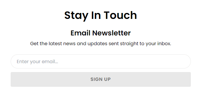
Section Fields:
-
Type:
- Options: Email, Phone, or Email & Phone.
- Default: Email.
-
Heading:
- Default: "Stay In Touch."
-
Email Signup Settings:
- List ID: Required to enable the submit button.
- Heading, Subtext, Placeholder Text, Button Text, Thank You Text.
-
Phone Signup Settings:
- Similar to Email settings, with additional fields for SMS consent and inline links.
Slider
Press Slider
The Press Slider section creates a responsive slider to display press quotes alongside corresponding logos.

Section Fields:
-
Slides:
- Alt Text: Configurable per slide for accessibility.
- Image: Press logo image.
- Quote: Text content displayed in the slider.
-
Section Settings:
- Full Width: Toggle to remove the max width limitation.
- Text Color: Customize the text color within the slider.
Products Slider
The Products Slider section is a dynamic slider designed to showcase products based on their handles.

Section Fields:
-
Heading:
- Configurable heading text for the slider section.
-
Products:
- Allows selection of products via a handle search and includes a maximum of four product handles by default.
-
Product Item Settings:
- Star Rating, Color Variant Selector, Quick Shop: Toggling options for each feature.
-
Slider Settings:
- Adjustable settings for the slider style and the number of slides visible on desktop, tablet, and mobile.
-
Section Settings:
- Customizes the button style and the full-width option for the slider.
Testimonial Slider
The Testimonial Slider section displays a collection of testimonials in a slider format.
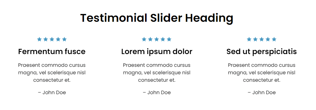
Section Fields:
-
Heading:
- Configurable heading text for the testimonial section.
-
Testimonial Slides:
- A group list where each slide includes a title, body, author, and rating.
-
Link:
- Configurable link text and URL, which can be set to open in a new tab.
-
Section Settings:
- Full Width: An option to make the slider span the full width of the container.
- Color Customizations: Options to customize the text color, slider pagination bullet color, and review star color.